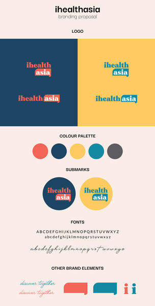
ihealthasia
branding & identity
the brief
This was by far the fastest (or shortest) project I've worked on so far, the client requested a logo and branding deck to be done in less than 24 hours. The brand is a digital platform to share useful health and medical information to the Asian community. The client wanted something more unconventional to capture the attention of the younger audience, while maintaining a credible and trustworthy tone.
the concept
I've decided to go a little bolder on the colours for this particular project, hence I proposed two different palettes - a blue and pink as well as a turquoise and yellow combination. Both combinations create a strong contrast which is eye-catching, with the hopes that it will arouse curiosity when came across.
The main element of the logo is the conversation bubble, which symbolises interaction and communication. This is well-aligned with the nature of the brand itself, as well as its purpose.
Client has decided to go with the turquoise and yellow logo variation, and out of my own curiosity, I've also created a mock on how it will look like when printed out as a collateral and a building signage.


